PORTFOLIO
Clarified Property Inspections & Reports
")

")
“We can not thank you enough”
Our business made a very costly mistake by going with a website designer that provided an underwhelming site which did not reflect our brand at all. The team at Online Optimisation re designed our site and fixed up the mess in the back ground. From the very first engagement to the completion of our site was stress free and highly professional. Thank you to your amazing team, we can not thank you enough.
Tracey Seghabi
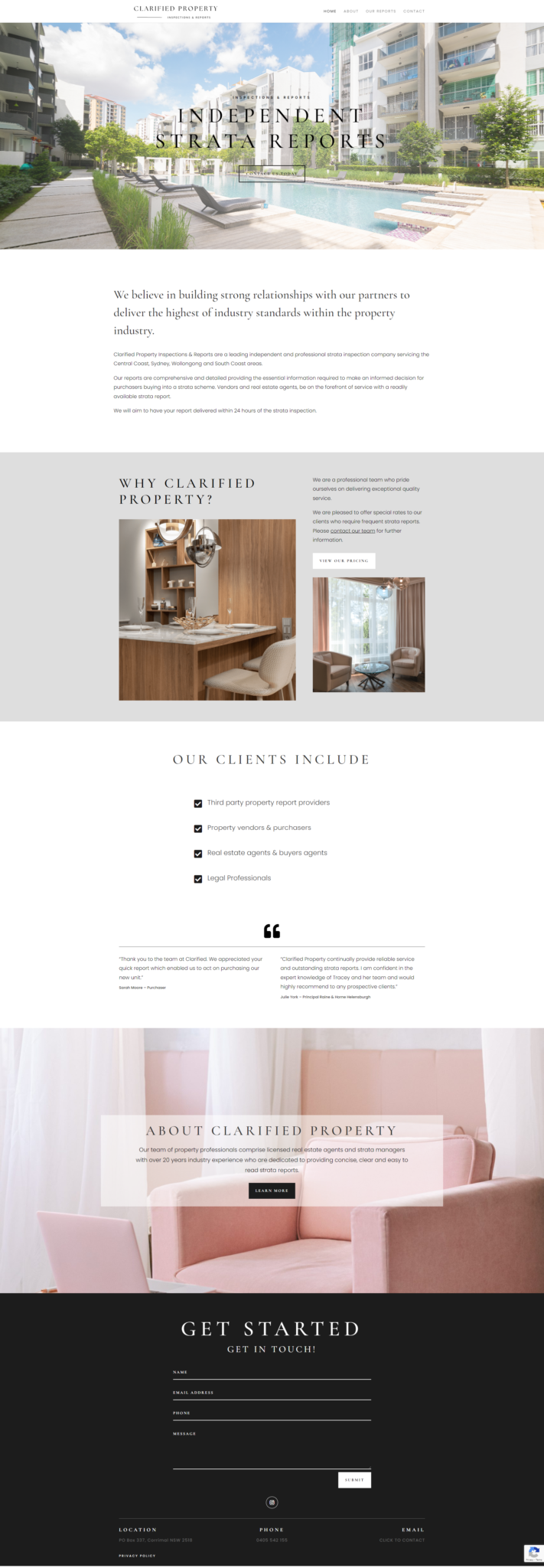
Clarified Property & Inspection Reports
Tracey from Clarified Property & Inspection Reports was amazing to work with. She knew what she wanted and we were able to create a design she loved fairly quickly.
Tracey came to us as her current website wasn’t really what she wanted. At Online Optimisation when we design a website we make sure we work one on one with the client. We keep designing till you have exactly what you want. There are no limits on the amount of tweaks you are allowed to make. If for some reason we couldn’t create what you wanted (it’s never happened) we would just give you your money back.
Your website needs to be something you love and it needs to be able to reflect your brand. Website design is something we have been doing for a long time … Our designer Mel is good at being able to work out what the client wants and she is able to mock up a rough design from what you tell her. If you don’t like what she has created that is not a problem she just takes on the feedback and has another go.
If you are interested in creating a website we would love to hear from you we are just located in Camden and all our websites are created right here in our office.
We look forward to continuing our relationship with Clarified Property & Inspection Reports and watching her online prescence gr
Device Friendly
When we launch a site we make sure it will look great on all devices. Including desktop computers, iPad tablets and mobile phone. Sometimes this means we add special custom tweaks that only get enabled at certain screen sizes, so the design of your website stays looking great. Certain aspects of your website we may remove on mobile view or visa versa. As part of this process, it’s not about making your site look good on specific screen sizes but instead looking good on all screen sizes. This makes the page dynamically responsive to the screen size it’s being shown on. The page adapts and changes to fit the width and height it has available. This helps make the site friendly for users, but also it helps ranking better on Search Engines like Google, as part of SEO is making sure you are user friendly. Our end goal is that your site is aesthetically pleasing but most of all user friendly!