PORTFOLIO
Show Limousines
")

Show Limousines
We are thrilled to announce the successful launch of a new website for our esteemed client, Show Limousines! Based in Camden, Online Optimisation proudly serves all of Sydney and the Macarthur area, and this project highlights our commitment to delivering exceptional digital solutions for local businesses.
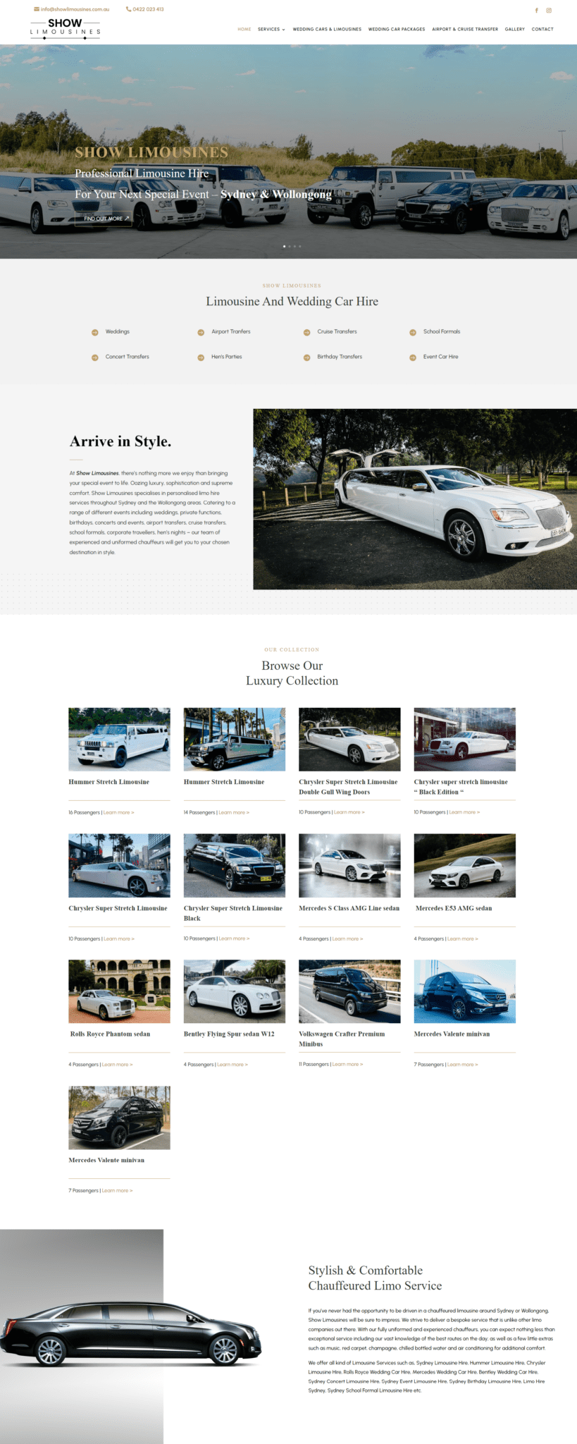
Show Limousines offers a luxurious fleet of limousines and formal cars, perfect for any special occasion. They needed a website that could elegantly showcase their diverse range of vehicles and provide potential customers with a seamless browsing experience. We crafted a sleek, modern design that reflects the elegance and sophistication of Show Limousines. The website’s layout is user-friendly, ensuring that visitors can easily navigate through the various sections.
We created a dedicated section to display the extensive collection of cars. Each car is featured with high-quality images, detailed descriptions, and key specifications, allowing visitors to explore their options in a visually appealing and informative manner. Understanding the importance of accessibility, we ensured that the website is fully responsive. Whether accessed via desktop, tablet, or smartphone, users will have a smooth and consistent experience.
The team at Show Limousines has expressed their delight with the new website, praising its professional look and the ease with which their customers can now view and book their luxury vehicles.
At Online Optimisation, we take pride in helping businesses shine online. This project with Show Limousines is a testament to our dedication to quality and our ability to deliver tailor-made solutions that meet our clients’ needs.
Device Friendly
When we launch a site we make sure it will look great on all devices. Including desktop computers, iPad tablets and mobile phone. Sometimes this means we add special custom tweaks that only get enabled at certain screen sizes, so the design of your website stays looking great. Certain aspects of your website we may remove on mobile view or visa versa. As part of this process, it’s not about making your site look good on specific screen sizes but instead looking good on all screen sizes. This makes the page dynamically responsive to the screen size it’s being shown on. The page adapts and changes to fit the width and height it has available. This helps make the site friendly for users, but also it helps ranking better on Search Engines like Google, as part of SEO is making sure you are user friendly. Our end goal is that your site is aesthetically pleasing but most of all user friendly!